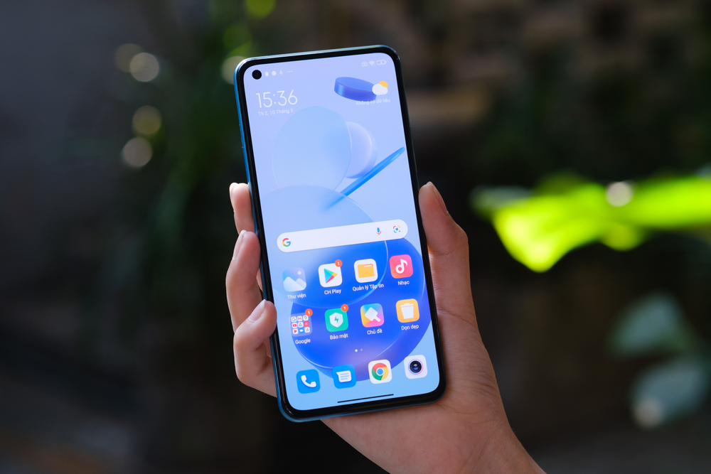
Google is testing a new way to unify the look and feel of third-party apps to make the desktop look better. SamMobile writes about it.

Earlier in Android 13, a feature appeared that changes the icons of applications – both third-party and built-in – in accordance with one design code. In theory, this feature should “align” the styles of completely different icons and help Android look more solid and unified, like iOS on the iPhone. However, in practice, it does not work with all applications, and usually after enabling this feature, the desktop starts to look even worse.
Google is testing an innovation that should fix this discrepancy. According to the iGuides, the latest build of Android 13 QPR2 Beta 2 introduced a forced redrawing of app icons, even if the developers have not adapted their app for this feature. A new ENABLE_FORCED_MONO_ICON item was noticed in the system code, which turns the icon of any application into monochrome, after which the current color accent of the entire system is superimposed on it.
The end result of this feature is impressive – one of the developers demonstrated it using two icons as an example. The desktop view is really becoming unified and now everything looks the way Google intended.
NIX Solutions notes that in iOS, all icons have been consistent with a single style for a very long time. Apple achieved this by strict moderation of applications in the App Store, but in the case of Google, this method will not help, and the company went the other way. Soon, Android smartphone users will be able to enjoy a unified design of all elements of the system.
